UTD Trends
I helped design and develop a full-stack website for the UTD student body as part of Nebula Labs. The platform serves 15,000+ unique users with professor ratings and class-specific grade distributions, becoming a go-to academic resource for students navigating course selection.
The Problem
Course registration at UTD is high stakes, but the information students need is scattered across disconnected tools. Grade data is hard to parse, professor reviews live elsewhere, and comparing instructors means opening a dozen tabs.
- Critical academic decisions were being made with incomplete information
- Data was available but not accessible or visual enough to act on quickly
- Students needed to compare professors and sections side by side, not one at a time
The Solution
UTD Trends is a data platform I helped design as part of Nebula Labs, alongside one other designer. It aggregates historical grade distributions and Rate My Professors ratings into one searchable, comparable interface. Students search by course or professor, filter by semester and section type, and immediately see the data that used to require three separate tools.
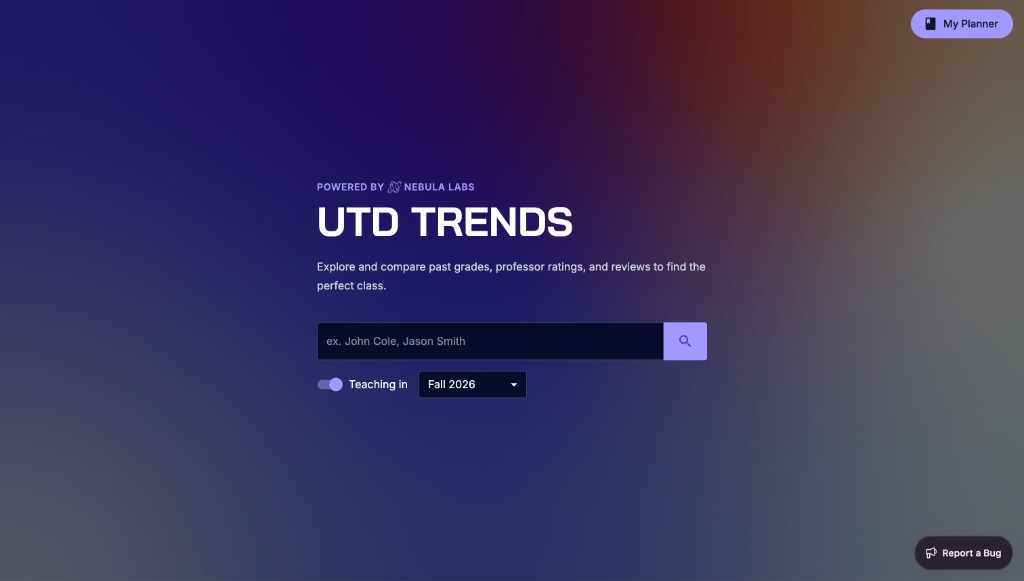
The landing page centers search, the fastest path to what students actually need during registration week.
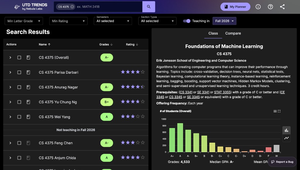
Unified Search & Filters
One search bar surfaces grade distributions and professor scores for any class or instructor. Students narrow results by minimum letter grade, rating, semester, section type, and whether a professor is teaching in the upcoming term.
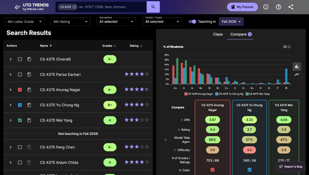
Professor Comparison
Select multiple instructors and compare grade distributions, GPA, ratings, difficulty, and "would take again" percentages on a single dashboard with no tab switching.
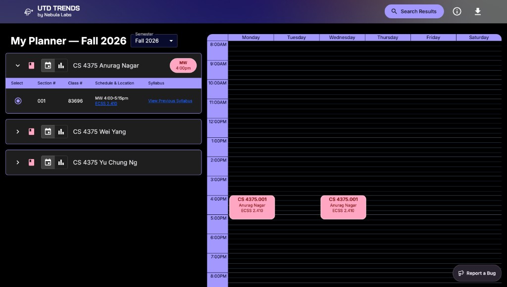
My Planner
A built-in semester planner lets students add sections and visualize their weekly schedule alongside the data that informed their choices, so research does not dead-end at a spreadsheet.
The dark UI, which I co-designed with one other designer, uses purple accents and high-contrast grade badges so distribution data stays scannable during long registration sessions.
UX Research
Three methods, one goal: design for real students, not assumptions.
Competitive Analysis
UTD Coursebook covers official descriptions but no grade history or ratings. Rate My Professor has reviews but no UTD grade data. UTD Grades surfaces distributions with a dated interface and no comparison. Trends combined what each did well into one experience.
Campus Intercept Interviews
I approached random students on campus, intentionally not friends, to avoid biased feedback. Their input shaped navigation, filter placement, and how we surfaced grade data.
Student Surveys
Surveys across the student body validated which data points mattered most and helped us prioritize professor comparison and semester filtering.
Outcome
15,000+
unique users served
UTD Trends became one of the most-used academic tools on campus. Students compare professors, read grade distributions before committing to a class, and plan semesters through My Planner. For me, it proved that real user research can change how an entire campus makes decisions.