User Experience Club Website
I helped design and develop the full website for the User Experience Club at UT Dallas, centralizing event details, resources, announcements, and member services into a single accessible platform for a community of 2,300+ members.
The Problem
The club had grown into one of the largest design communities at UT Dallas, but everything it offered lived somewhere else. Event details were buried in Instagram posts, answers were scattered across Discord threads, and there was no single place to point someone who simply asked what the club was.
- Event information was spread across social media with no source of truth
- New members had no obvious starting point to learn what the club actually does
- Flagship events needed real space to attract attendees and industry professionals
The Solution
Working with the club's design team, I helped build uxutd.com as the club's front door: one platform holding event details, resources, announcements, and member services together.
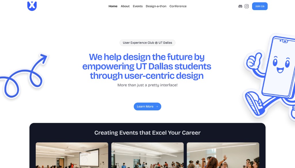
The home page leads with what the club stands for, then immediately shows proof through photos from real events. A single primary action, Join Us, sits in the navigation on every page so interest never has to hunt for a next step.
Flagship Events, Their Own Worlds
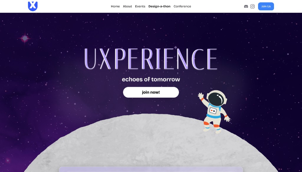
UXPERIENCE is the club's 24-hour design challenge and the largest in-person one in Texas. A generic event listing would have undersold it, so it got a dedicated page with its own identity, built around the theme and carrying a clear path to sign up.
Details Where People Look First
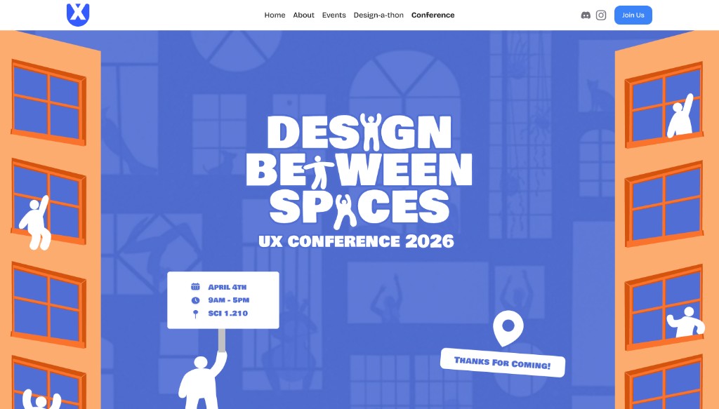
The UX conference page leads with the three things every attendee needs before anything else: date, time, and room. Everything decorative sits behind that answer rather than in front of it.
Each flagship event carries its own art direction, but all of them live under the same navigation, so visitors explore without ever leaving the site.
UX Research
We watched real people use the site, then fixed whatever tripped them up.
Live Usability Testing
Rather than guessing at what worked, we ran live testing sessions with club members and students seeing the site for the first time. We handed them real tasks, such as finding the next event, figuring out how to join, or learning what a design-a-thon even is, and then stayed quiet and watched them navigate on their own.
Tracking the Roadblocks
During every session we noted each hesitation, wrong turn, and moment someone doubled back. Anything that tripped up more than one person got flagged as a real pain point instead of a one-off.
Iterating on What We Saw
Those findings went straight back into the design. We rewrote navigation labels, pulled event details higher up the page, and strengthened the path to join, then put the updated site in front of people and watched again.
Outcome
2,300+
members served
The site became the club's central platform, replacing scattered posts and threads with one accessible home for events, resources, and member services. It carried a UX conference and the largest in-person 24-hour design challenge in Texas, each drawing 200+ attendees and industry professionals from across North Texas.
Testing with real users, instead of trusting our own instincts about our own design, is what made the difference between a site that looked finished and one that actually worked.